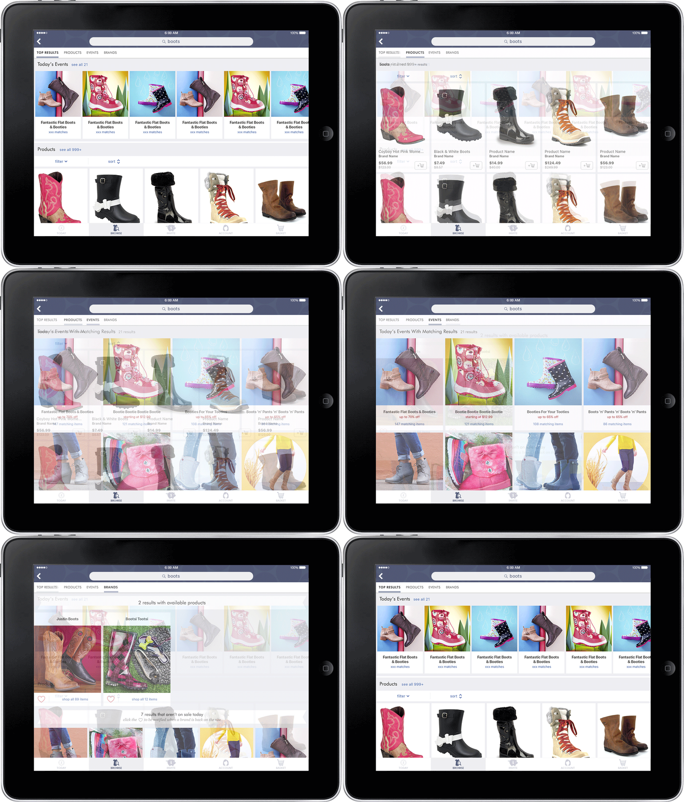
The initial design request was to incorporate daily sales in the search results on zulily.com.
My research included competitive analysis, looking at internal data, and studying search usability best practices. After finding most zulily customers searched for products and brands rather than daily sales, I pitched a full redesign that was capable of scaling to include search results for brands along with products and daily sales.
In addition to search results, the project scope included designing results filters for smaller mobile screens, creating logic for sorting results and handling typos and misspellings, and creating brand pages for the apps to create a more consistent experience across platforms.
Search on iOS devices
Overview of search results on desktop
Brands results on desktop
Sorting logic
Brand page on iOS devices
iPhone wireframes for Brand Pages
The goal for this project somewhat open-ended: when a new customer comes in from a search engine, make the page they land on better.
I started with competitive analysis and researching SEO best practices, then began the design explorations of what "better" could be. Through multiple rounds of design iterations, I helped the stakeholders identify a couple of core goals: provide the customer with content relevant to their initial search term, introduce cross-category shopping, create avenues to continue shopping, and introduce them to zulily’s discovery shopping model & value proposition.
Responsive landing page on desktop and mobile
In the old experience, when customers came to the site via search engines, the only introduction to zulily’s brand and flash sales model was a large, out-of-date looking banner.
There are multiple components within the final landing page design. The top section shows dynamically filtered search results. The second module introduces zulily's business model and brand proposition, while the third module shows some of the more popular brands that zulily frequently carries, with a CTA of loving those brands to be notified when they're on sale again. The remainder of the page is dedicated to sales that are related to the customer's initial search term.
Early, high-fidelity design explorations
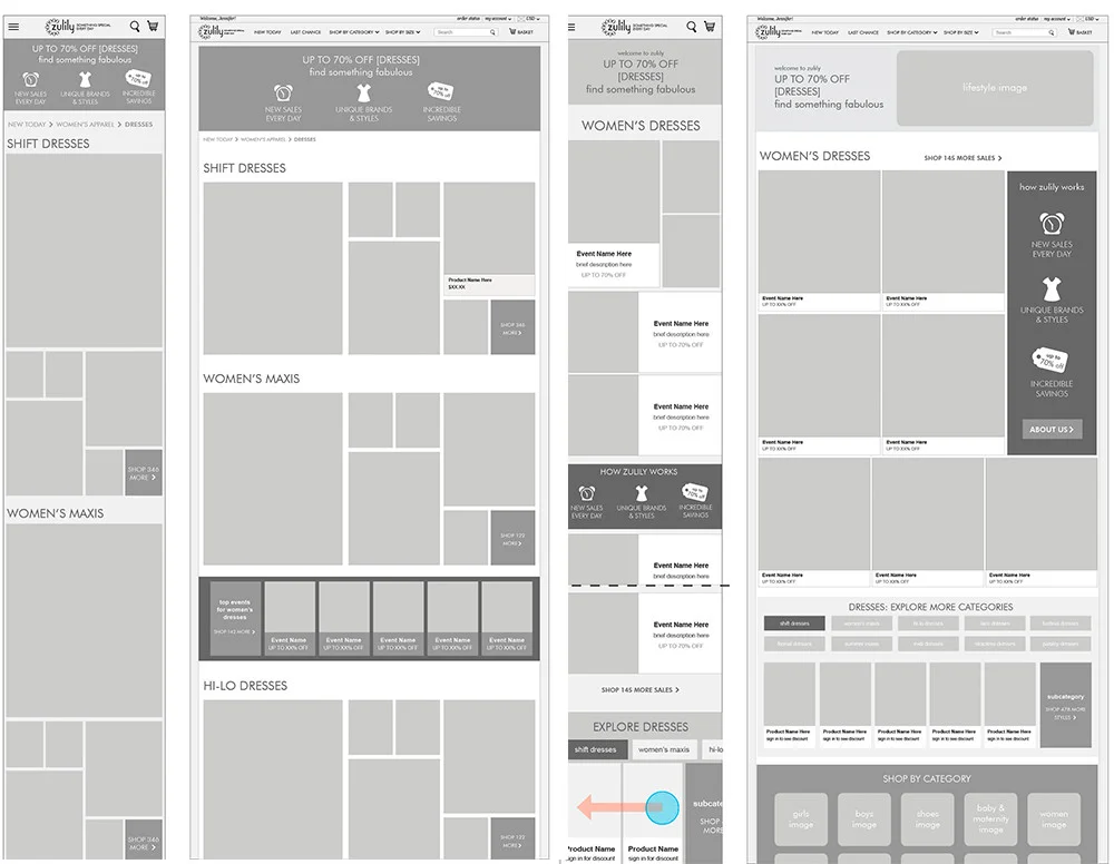
Low-fidelity layout explorations
The Loyalty Program initially started out as a means to reward highly-engaged customers. However, while researching and planning the program, we realized there was potential to engage new customers as well, so the goals became twofold.
After exploring multiple ways to engage customers, I designed a program framework around the idea of earning "petals" which created an enticing path of progression towards money-back rewards.
Because of the high financial impact of a program like this, throughout the project I communicated the program development & vision to the executive stakeholders. This early effort ensured that customer experience and financial strategy developed side by side.
Program landing page
Introductory program launch email
New loyalty customers default to a secondary landing page explaining program benefits.
Comps for iPhone
Wireframes for iPhone
Every morning at 6am, zulily sends an email with the new sales of the day – it’s the primary driver of site traffic. Along with the daily email, members are automatically signed up to receive emails for onboarding, downloading the app, special events, weekly summaries, and more. The options on the unsubscribe page were limited and users didn’t understand what content they were opting into or out of.
Our primary goal for this project was pretty straightforward: reduce email unsubscribe rates. We also had a secondary goal of gathering feedback on why the customer is unsubscribing.
After working through user scenarios we came up with a few ideas on how to improve customer engagement on the email channel: encouraging opting down instead of opting out by giving customers more control over cadence; giving a "snooze" feature that temporarily suspends email notifications; and reinforcing the value of email communication (brand notifications, special coupons, etc).
The original plan was to do a number of iterations on the design once the revamped page was live. However, the redesigned page immediately resulted in a significant reduction in unsubscribe rates, thus further iterations became less of a priority.
Wireframes
Wireframes
Case study coming soon